
Cover art may seem outdated in this emerging era of digital distribution, but physical products still command a majority of the sales and will for some time. Even for products that don't have a physical presence, a compelling visual and a catchy title is useful on a web page or product page. Good cover art can help sell products, especially when surrounded by the right words.
The corollary, of course, is that bad cover art can keep your product from selling. This article shows a number of horrible game covers, some from the not-so-distant past. It's good for a laugh, but it's worth looking at these covers and thinking about just what it is that makes them so bad.
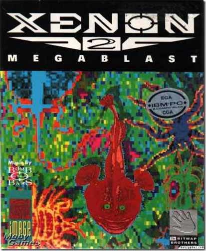
For the most part, the artwork used didn't represent what the game was about; in some cases it was amazingly far away from the nature of the game (an old guy with a banjo? Really? How does that connect with a space shooter?). The above example is bad on so many levels. I can only hope that the artwork shown is not taken from the game; if that's the best you've got, don't even bother to put the thing on the market.
Let's start by noting that the title is all but unreadable. Your title should be clearly readable; better still, pronounceable; and for full credit, it should have something to do with the game and get the customer interested.
As for the artwork... it should be as excellent as you can afford. Hopefully you or someone you know has the ability to tell good art from bad, or at least can hire a competent art director to make that judgment for you. The art should be clearly understandable at a glance, and communicate the key features of the game (the same key features you decided on when you created your product platform document... which I will discuss in an article on my web site).
Glancing at the examples shown in the article will give you a lesson in many ways to fail at good cover art, and a good laugh or two.


No comments:
Post a Comment